AppPlus Multipurpose Responsive Zen Cart Theme
Features
All the default functionality is active and untouched for our Zen Cart themes.
Only one setting parameter is disabled for our Zen Cart responsive themes in the admin area (column width) due to the fact the responsive feature requires a special layout, so we created a new layout that is based on "div" HTML tag, not the "table". Columns width is defined automatically when you change 3 or 2 column layout in the admin area.
More information about our responsive themes can be found there:
blog.12leaves.com/category/zen-cart-themes/responsive-mobile/
Instructions and Articles From our Blog
- Theme settings and features on the example of our another theme.
- How To Install Zen Cart Template
- How To Add New Language To Zen Cart
- How To Add Social Media Buttons To Zen Cart
Description

Improve your CONVERSION with stunning theme design and simple usability.
- Google Mobile-Friendly Test passed
- Availability to track mobile users with Google Analytics
Responsive Zen Cart theme modern design allows you to get a well-adaptive template appearance for any devices, including a wide range of tablets and mobile phones. The template does not require a separate installation of Zen Cart or any mobile theme to look adapted for tablets and mobile devices, only CSS style files are used for this purpose. Responsive touchable sideshow and conveyor/carousel banners automatically re-sizes to device screen. Modern Fluid columnar product displaying automatically set a numbers of the columns via CSS styles, so that it gives the template a professional look on any mobile and tablet devices.
You can easily set 3 or 2 column layout via Zen Cart admin area. All Zen Cart admin features are stayed untouched, so you can change all the elements after the template installation by the same way as you can do it via default Zen Cart admin area. Only one setting parameter is disabled for the theme in the admin area (column width) due to the fact the responsive feature requires a special layout, so we created a new layout that is based on "div" HTML tag, not table. Columns width is defined automatically when you change 3 or 2 column layout.
You can easily set 3 or 2 column layout via Zen Cart admin area and product columns will stretch automatically. Set the number of the product columns in Zen Cart admin area according to your needs. Categories Dropdown menu feature allows to get the second level subcategory items directly. Shopping cart dropdown menu makes easier and faster access to the purchases you made. Multilanguage is supported. You can easily change the language or currency via dropdown menu.
Columnar Responsive Product Listings
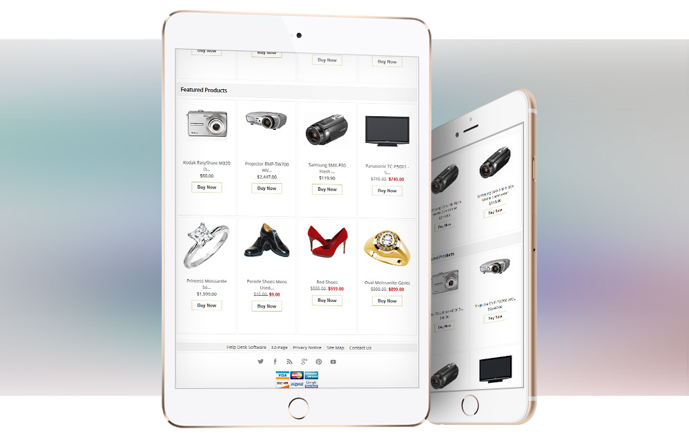
Make your users comfortable with product listing and they will thank you.
Columnar responsive product listings automatically adapt to 4-column, 2-column or 1-column listing in accordance to the browser width. Only CSS styles are used for this purpose. See more screenshots under the main product image.
Any Color You Wish
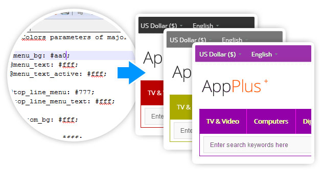
The color of some major elements of the theme are in one place in LESS file color variables. For instance, if you change the color of the menu background via only one variable, the border of the menu, its separators and all the subcategories will be changed in appropriate color either. Even some other color of elements, such as some headings and main sidebox badges will change the color automatically.
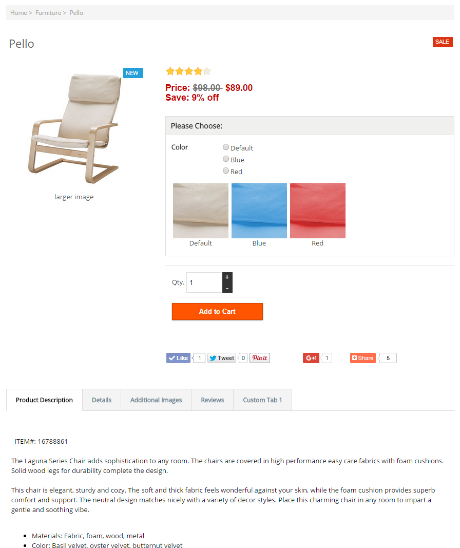
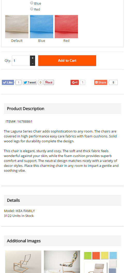
Tabbed Product Details Page
Tabs with the information are included to the product details page. Any custom tab can be added to the section. Instructions of the module are included.
Desktop Tabs View
Mobile Tabs View
Instant Access
All the templates are available for immediate download after the payment and the verification steps are completed. Details for download will be e-mailed to the address you specified during the checkout process usually within 3-5 minutes. In some special cases it takes more time.
